Boosting FP&A Efficiency: The Alteryx and Tableau Partnership
This article contains 4 sections:
The Limitations of Excel in a Data-Driven World
Exploratory Data Analysis (EDA) using Tableau
Analytics Automation using Alteryx
Embracing the Future of Financial Modeling
The Limitations of Excel in a Data-Driven World
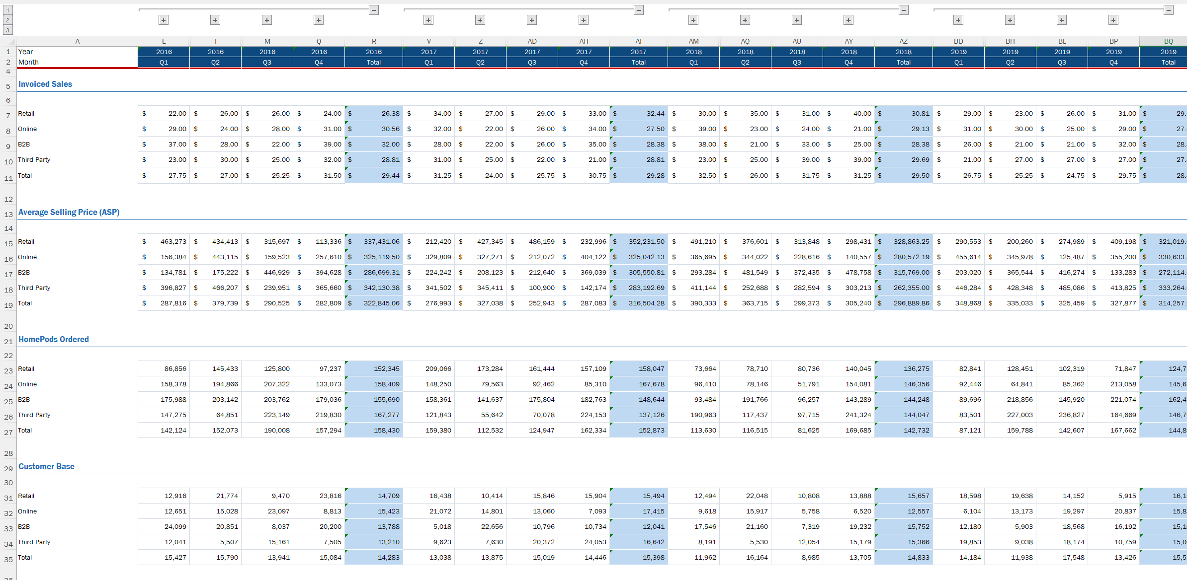
How familiar is the excel spreadsheet below:
Example of an excel workbook displaying financial data
The image exemplifies customary practice among finance managers in operating their departments. But it is not necessary to examine the image. The reason for showing it is to illustrate the breadth of financial reporting done in Excel.
Excel provides advantages such as its familiarity and ease of use. The program is also flexible, allowing users to perform calculations and ad-hoc analysis. Yet excel comes with flaws too.
Inherent Flaws of Reporting in Excel:
The platform lacks efficiency when managing large datasets. While the level of automation provided is inadequate for today’s FP&A teams.
Excel comes with many performance limitations. The use of the tool is often manual, which poses significant risks to accuracy.
There is a lack of governance features. It can be hard to manage versions while cells are usually hard coded. This also applies to broken links which occur to save disk space.
Organizations must look to replace their reliance of excel. Technology provides applications that enable robust and auditable solutions. These changes help to maintain a competitive edge and enable data-driven decision-making.
Exploratory Data Analysis (EDA) using Tableau
Let us look at this data in a unique way. The below Diagnostic Dashboard displays descriptive analysis of our data.
This Diagnostic Dashboard provides insight into the relationship and shape of financial data
What are two clear benefits of displaying our data this way?
Preparation for building and evaluating statistical models. Statistics is not reserved for undergraduates uncertain of which major to pursue. It deals with the analysis, interpretation, and organization of data. Visualizing our dataset this way provides valuable insights hidden in excel. Better predictions come from our understanding of these patterns and relationships.
The ability to observe the relationships between each of the variables. At a quick glance we can observe valuable information about our dataset. The goal of a financial analyst is to communicate insights to stakeholders. Using one's effort to update an Excel workbook hinders effective communication.
Investing the time to deeply explore your data is worthwhile in itself, and it can save you time and trouble later on. Exploratory data analysis (EDA) is the name for this effort, and it's a critical part of the data science lifecycle.
Correlation Matrix: Association Analysis
The correlation matrix provides a statistical method to measure the strength of relationships. The color provides context into how strong each variable's linear relationship is. The deep red shading for Orders indicates a strong positive correlation with Revenue. You can observe an inverse (negative) relationship between Inventory and Price.
Visual Representation of Correlation in Tableau
A concept to be mindful of here is collinearity. Collinearity identifies independent variables whose relationship with each other is highly correlated. This can be a flaw as it makes it difficult to estimate the individual effects of variables. It creates redundancy in explaining the relationship with Revenue. Observe how Consumption and Customers show a strong relationship with each other.
In statistics, collinearity refers to a linear relationship between two explanatory variables. Two variables are perfectly collinear if there is an exact linear relationship between the two, so the correlation between them is equal to 1 or −1.
Distribution Analysis: Frequency Histograms
The histograms below reveal distinct distributions for each variable, beyond mere scale differences.
Orders exhibit a positive skew.
Consumption displays a symmetric distribution with a slight positive tendency.
Inventory presents a symmetric distribution with a leftward inclination.
These observations prompt consideration of whether the patterns represent valid trends or anomalies. The visualizations offer valuable insights to inform such assessments and subsequent decision-making processes.
Visual representation of Histograms using Tableau
As we move from one variable to another we start to understand more about our data. This would be cumbersome to do examining an Excel spreadsheet alone.
Histograms are one of the most important tools for data analysis. They provide a visual representation of the distribution of a dataset, allowing data analysts to identify patterns and trends in the data.
Analytics Automation using Alteryx
Let us now walk through the process which enables visualization in Tableau. Alteryx provides Analytic Automation of the steps needed to perform our analysis. The platform provides a repeatable workflow defining the given process. It is auditable and provides documentation right within the flow. Alteryx can also provide error checking to ensure financials come in as planned.
With analytics automation, business professionals can easily connect to nearly all their organization’s data, transform and enrich it, and produce actionable insights that can be presented or written to a data management system or business intelligence (BI) dashboards.
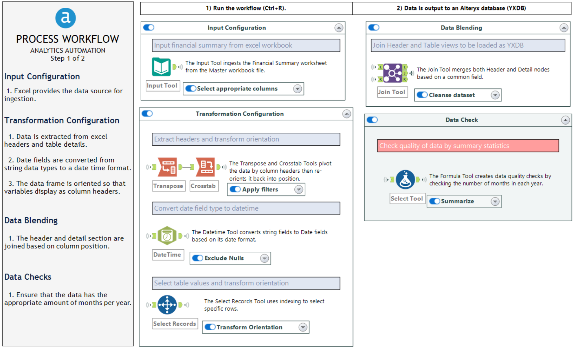
Step 1 Extract and Transform
Analytics Automation of an ETL process to extract data from an excel workbook
The above process extracts the needed data from our excel workbook. The workflow outlines four steps. The first step pulls the desired worksheet from Excel into Alteryx. The next step transforms the data. Two separate workstreams process data Excel assigned in columns and rows. The third step blends both data streams together (Header and Row details). The last step provides an audit of the data to ensure the appropriate number of months are in each year.
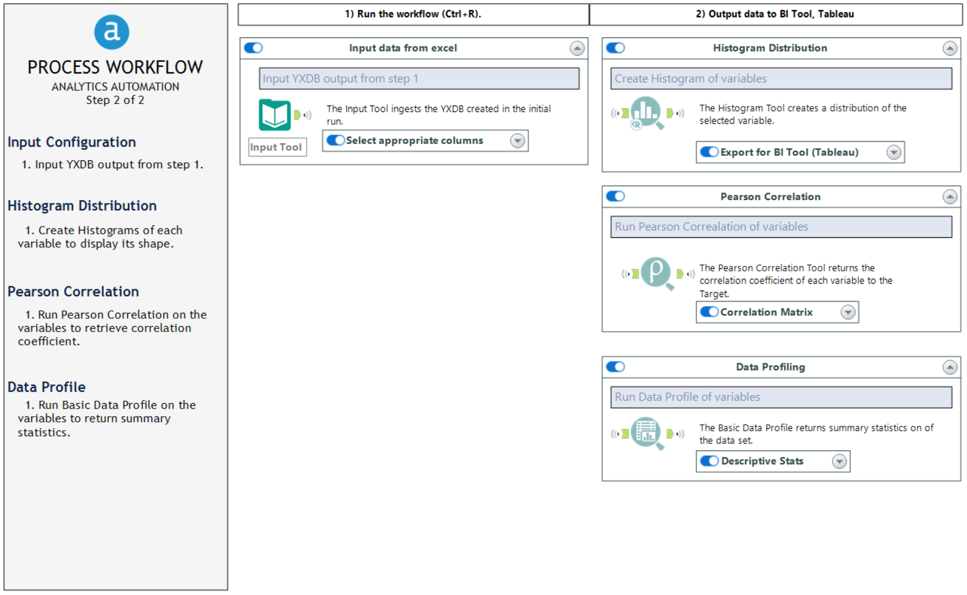
Step 2 Load the Data into a BI Tool
Analytics Automation of an ETL process to load data into a BI Tool
The next analytic process provides the dataset for our Tableau dashboard. The initial process ingests the database saved from the previous process. The first extract provided is to display the variable histograms. The Histogram Tool accomplishes this by outputting the bins and frequencies of values (Distribution Analysis). While the Pearson Correlation Tool gives insight into the variable's relationships via a coefficient (Correlation Matrix). The last tool, Basic Profile, provides summary statistics on our dataset (Data Quality). This tool provides insight into the number of Null or Incomplete records.
After the workflow completes, a new file is created as a Tableau Data Extract (TDE). This can be consumed by Tableau to create the above dashboard.
Embracing the Future of Financial Modeling
Transitioning from traditional spreadsheets can be challenging! Yet, the benefits of adopting advanced tools like Alteryx and Tableau are large. Excel's limitations often hinder effective decision-making. Alteryx streamlines data analysis and automation, while Tableau enhances data visualization. Together, they enable FP&A teams to perform financial modeling and forecasting.


